Lesson 7 — Fulfillment Flow Patterns with Scatter Charts
Scatter charts reveal the shape of your fulfillment flow. They show variation, drift, clustering, and stress patterns that no spreadsheet can capture.
This lesson explains how FillSpeed’s scatter charts work, what they reveal, and how to interpret them to understand the health of your operation.
1. What Is a Scatter Chart?
A scatter chart plots individual orders as points.
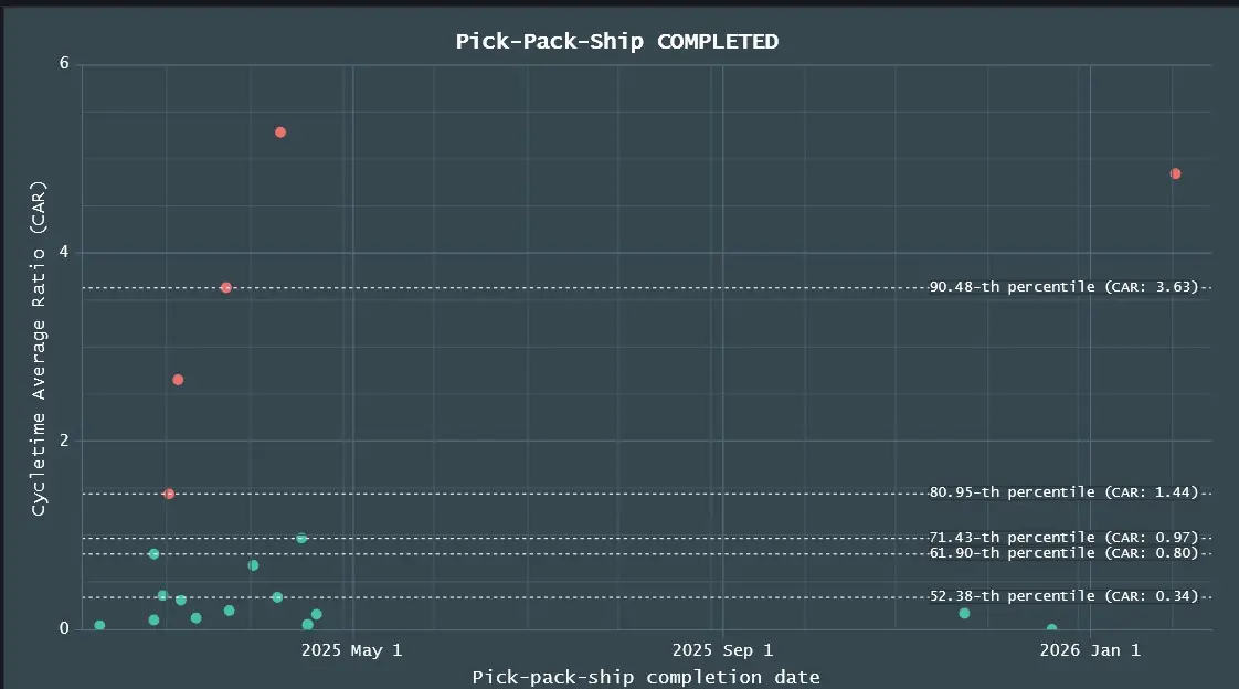
- X‑axis: When the order was processed
- Y‑axis: Cycle time or CAR
- Each point: One order’s performance at a stage
Scatter charts show the distribution of performance — not just the average.
2. What the FillSpeed Scatter Chart Shows
FillSpeed’s scatter chart reveals:
- real‑time distribution of cycle times
- variation across orders
- clusters of slow or fast orders
- stress periods (waves of high CAR)
- drift (cycle times rising over time)
- outliers (orders that took unusually long)
Scatter charts show the texture of your flow.
3. Percentiles: Understanding the Spread
Percentiles show how wide or narrow your performance band is.
- 50th percentile (median): Typical performance
- 75th percentile: Stress threshold
- 90th percentile: Early warning
- 95th percentile: Severe delay
Percentiles reveal whether your operation is:
- tight and predictable
- wide and unstable
- drifting upward
- recovering downward
4. Clustering: The Signature of Flow Health
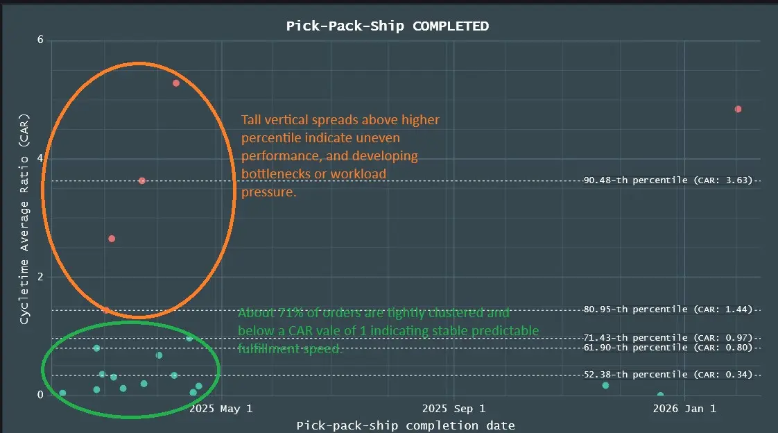
Clusters reveal patterns such as:
- batching behavior
- operator variability
- inventory issues
- station‑level bottlenecks
- time‑of‑day effects
- carrier pickup waves
Clusters are the fingerprints of your operation.
5. What Scatter Charts Reveal That Averages Hide
Averages hide:
- spikes
- waves
- bottlenecks
- outliers
- drift
- instability
Scatter charts expose them instantly.
This is why top e‑commerce companies rely on scatter charts to understand flow health — and why FillSpeed brings this capability to Shopify merchants.
6. Why This Lesson Matters
Scatter charts show variation — the most important indicator of flow stability.
They help you see:
- when flow is stable
- when flow is drifting
- when bottlenecks are forming
- when operators are overloaded
- when carriers are delayed
Scatter charts are the microscope of fulfillment intelligence.